This quick tip works equally well for email newsletters and product pages or product marketing launch pages. We’re talking about buttons – with a strong call to action.
I’m always looking for quick, easy ways to improve click throughs in emails or on product pages. Because sometimes, the simplest tweaks can result in the biggest rewards. And it’s always fascinating to me how the smallest change can completely alter a person’s behaviour!
So today, let’s talk about buttons. Particularly buttons with a strong call to action!
WHY YOU NEED TO USE BUTTONS IN YOUR EMAIL MARKETING
Most people who read your emails or scroll your product listings are probably doing so on their phones . ***
Clicking on text links on our phone is always a little more challenging than clicking while on a desktop or laptop – or even a tablet.
Big thumbs, small screens.
This is especially true when the links are short, one or two word text links.
If you’re not already, start using buttons in your emails and on web pages where you have an important call to action you want the reader to take.
They’re big, they’re bold, they stand out and, they’re easy to click when you’re holding a phone.
And unlike 5 or 10 years ago where including a button meant doing some coding, now they’re as simple as drag and drop so there’s no reason not to.
BONUS TIP: USE STRONG CALL TO ACTION LANGUAGE.
When you use a button, it’s important to use strong call to action (CTA) language that makes it clear what clicking the button will do.
Strong CTAs you might want to use include:
- BUY IT NOW
- GET YOUR EBOOK NOW
- READ THE BLOG POST
- GET THE RECIPE
- SUBSCRIBE NOW
You can also use an arrow icon on the button to make it even clearer that something is going to happen when they click that rectangle.
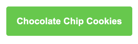
Not that long ago I started transitioning clients from using the name of the recipe on a button to using a strong CTA.
So this…
Changed to this:
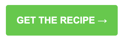
Every single one of them saw an uptick on click throughs by changing the CTA on the buttons. It was amazing what such a small change could do.
If you’re not already, try using buttons in your emails and on your website when you need the reader to take action.
If you are using buttons, make sure you’re using simple, strong language that directs the reader to take action.
Track your results and see the difference!
*** Not all email lists are the same. Don’t assume your readers are mostly mobile users even if that is the industry norm. Always check your data to see what your list is doing and tailor your emails accordingly!
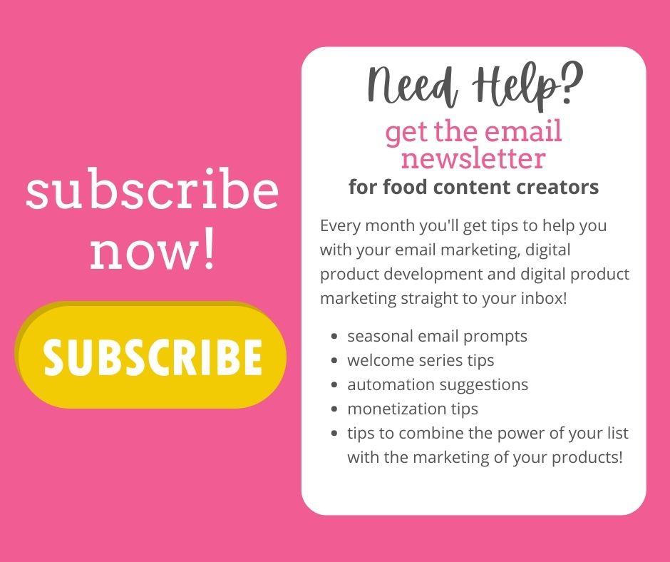
Want more quick tips to help you with your email and digital product marketing? Subscribe to my monthly newsletter! Each month I write an exclusive newsletter full of tips, tricks and ideas for food content creators and their email lists!
PIN FOR LATER