This quick tip works equally well for email newsletters and product pages or product marketing launch pages. We’re talking about buttons – with a strong call to action.
I’m always looking for quick, easy ways to improve click throughs in emails or on product pages. Because sometimes, the simplest tweaks can result in the biggest rewards. And it’s always fascinating to me how the smallest change can completely alter a person’s behaviour!
So today, let’s talk about buttons. Particularly buttons with a strong call to action!
WHY YOU NEED TO USE BUTTONS IN YOUR EMAIL MARKETING
Most people who read your emails or scroll your product listings are probably doing so on their phones . ***
Clicking on text links on our phone is always a little more challenging than clicking while on a desktop or laptop – or even a tablet.
Big thumbs, small screens.
This is especially true when the links are short, one or two word text links.
If you’re not already, start using buttons in your emails and on web pages where you have an important call to action you want the reader to take.
They’re big, they’re bold, they stand out and, they’re easy to click when you’re holding a phone.
And unlike 5 or 10 years ago where including a button meant doing some coding, now they’re as simple as drag and drop so there’s no reason not to.
BONUS TIP: USE STRONG CALL TO ACTION LANGUAGE.
When you use a button, it’s important to use strong call to action (CTA) language that makes it clear what clicking the button will do.
Strong CTAs you might want to use include:
BUY IT NOW
GET YOUR EBOOK NOW
READ THE BLOG POST
GET THE RECIPE
SUBSCRIBE NOW
You can also use an arrow icon on the button to make it even clearer that something is going to happen when they click that rectangle.
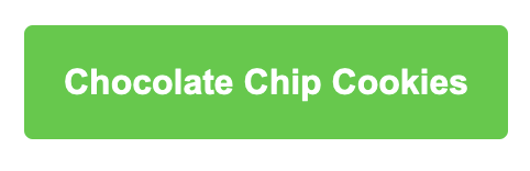
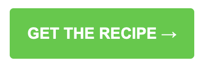
Not that long ago I started transitioning clients from using the name of the recipe on a button to using a strong CTA.
So this…
Changed to this:
Every single one of them saw an uptick on click throughs by changing the CTA on the buttons. It was amazing what such a small change could do.
If you’re not already, try using buttons in your emails and on your website when you need the reader to take action.
If you are using buttons, make sure you’re using simple, strong language that directs the reader to take action.
Track your results and see the difference!
*** Not all email lists are the same. Don’t assume your readers are mostly mobile users even if that is the industry norm. Always check your data to see what your list is doing and tailor your emails accordingly!
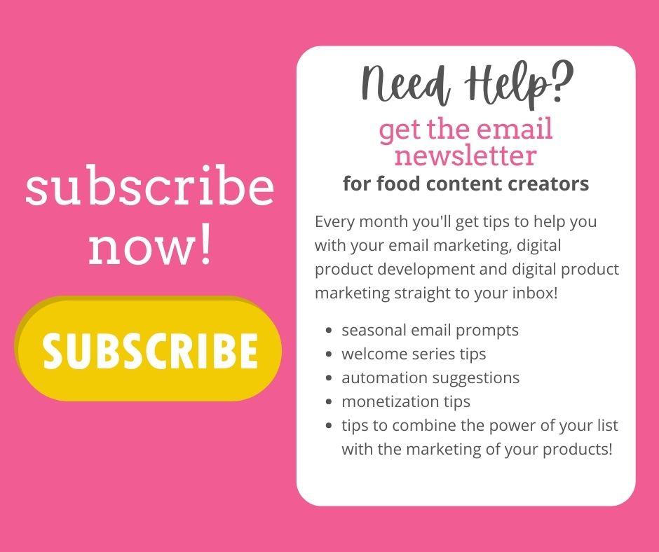
Want more quick tips to help you with your email and digital product marketing? Subscribe to my monthly newsletter! Each month I write an exclusive newsletter full of tips, tricks and ideas for food content creators and their email lists!
All digital products require consistent marketing to keep sales coming in. Here is a super simple way to to market your ebooks, printables or digital courses that isn’t too sales-y.(PS it also works for physical products!)
So… you’ve created this new digital product. Maybe it’s an ebook, or a downloadable printable. Or a digital course.
You’ve funneled time, money and energy into it and it’s perfect. It’s packed with helpful, practical information and tips. It’s beautiful to look at. And you just know it’s exactly what your people need to make their lives or businesses better.
There’s just one problem.
Nobody’s buying it.
Almost everyone who has launched a digital product has experienced this and it can be, at best, frustrating. At its worst, it can be a blow to your self-confidence and make you wonder why you’re doing what you’re doing.
One Key Thing You Need to Know About Selling Any Product or Service
Before you get too down on things it’s really important to know that most customers, or potential customers, require at least 7 touch points with your product before they’ll purchase. This is a key takeaway to factor into your digital product marketing plans! (oh and it also works for physical products!)
If you share your new product on Instagram , Facebook and Tik Tok once each, that’s 3 touch points…sort of.
If you have different audiences on each platform, it may only be once touch point for each of them…. maybe. If they didn’t see your post (because, algorithms) then it’s actually zero touch points!
Now you’re starting to see just how much marketing you’ll need to do to hit 7 touch points with most of your customers. You need to be promoting your new ebook constantly and consistently.
But what if you don’t want to be too sales-y?
I get it. It feels weird and awkward and even you get sick of hearing yourself talk about your new baby.
So here’s a super simple tip that takes very little effort and helps you get eyeballs regularly on your products.
Promote Your Digital Products to Your Email List In Every Newsletter
Before you groan, this is not as sales- y as it sounds.
Here’s what you are NOT going to do:
you are NOT going to go on and on about your product in each newsletter
it is NOT going to be the first thing, or even the second or third thing you talk about
you are NOT going to annoy your subscribers
Here’s What You ARE going to do:
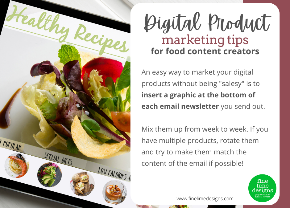
Create 3-4 different graphics for each product you have. Aim for about 640px wide by 200px high – about the width of your newsletter
Your graphics should show an image of the product (a book cover, the logo for your course etc) and have a small amount of text encouraging people to buy
Insert one of the graphics into the bottom of your next newletter, just above your sign off – like an ad!
Make sure the graphic links to somewhere they can buy the product
If you like, you can also write a short paragraph blurb highlighting a great feature or benefit of your product. If you do this, make sure you include a text link so they can buy
Add a button that says something like “GET YOURS NOW” or “BUY NOW”. Buttons convert well in emails – better than images and text links
Rotate your graphics each week so they don’t see the same image every week.
If you have multiple products, rotate the product you feature each month – if you can tie it into the theme of your newsletter or a key point in your newsletter that’s even better.
By doing this, you’re not in your subscribers faces each week. You’re not pushing them to buy.
You’re simply reminding them that you have this product and, when they’re ready, it’s there waiting for them.
You also need to remember that each week, you have new subscribers who have never seen your product before. They are starting from zero touch points!
You’ll still need to regularly promote your products on social media and to your network but that’s a tip for another day!
In the meantime, add these graphics into your rotation and it’s a very simple way to market your books, products and courses every week to the people who are most likely to buy from you!